For this project, we had to create our own iPod using Adobe Illustrator, showing 3 different angles and including the effect Extrude and Bevel. My final product shows the first angle, which was the front showing the screen of the ipod, the second angle was the side, and the last one was the back. We also had to create our own skin for the ipod, and mine showed a girl holding an umbrella under the rain on the back of the ipod. I used the elements of design by using the color black, which shows the the form of the ipod, and including a smooth texture on it. I used the principles of design by including gradation on the screen to make it more realistic, by making the ipod proportionate, and by having harmony. My final product also accurately represents my sketch.
Friday, December 16, 2011
myIPOD
For this project, we had to create our own iPod using Adobe Illustrator, showing 3 different angles and including the effect Extrude and Bevel. My final product shows the first angle, which was the front showing the screen of the ipod, the second angle was the side, and the last one was the back. We also had to create our own skin for the ipod, and mine showed a girl holding an umbrella under the rain on the back of the ipod. I used the elements of design by using the color black, which shows the the form of the ipod, and including a smooth texture on it. I used the principles of design by including gradation on the screen to make it more realistic, by making the ipod proportionate, and by having harmony. My final product also accurately represents my sketch.
Monday, December 12, 2011
mySPACE
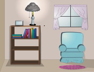
In this project, we had to make a space around the lamp that we created in our previous project using Adobe Illustrator. We were able to put 3D effects again to create the room that the lamp is in. For my project, I placed my lamp in a typical room, on top of a bookshelf. In that room, I also created a picture frame, a plant, chair, rug, and a window. I used the elements of art by using lines to create the shape of the objects in my room, having value and color, and by showing texture on the flower pot and rug. I used the principles of design by including gradation to show where the light is coming from, as well as by having harmony and variety. This accurately represents my sketch, except that in here, I added the picture frame and the window curtains.
Tuesday, December 6, 2011
myLamp
For this project,we had to create our own unique lamps using adobe illustrator. We had to apply 3D effects to make our lamps look real. My final product shows a lamp that's designed as a person standing under a cloud. The lamp shade has symbols of clouds and rain, and i also included a symbol of a lightning that's about to strike the person. I used the elements of art by including color, which shows the form of the lamp,value, and a smooth texture. I used the elements of design by making my lamp balanced and proportional. This accurately represents my sketch, except for the lamp shade, which didn't turn out the way I planned it to, and the facial expression in the person, which I changed while working on this assignment.
Wednesday, November 30, 2011
Emotion- Submission
For this Assignment, we were each given an emotion, with mine being submission. We had to create an icon for that emotion, making it simple and minimal. My final product shows a man kneeling to a king and holding a white flag. Since submission means to surrender or yield to the authority of another, I made the man hold a white flag to show surrender, and drew him kneeling to show that he's recognizing the authority of the king. The elements of art used in my project includes the lines that were used to make the shapes of the king, man, flag, and chair in my project. I used the principles of design by making the objects in my project proportionate. This accurately represents my sketch, since I first drew a white flag as one idea, and the man kneeling to a king as another idea. The difference was that I combined those two ideas in my sketch here on my final project.
Monday, November 21, 2011
stillPHOTO
For this assignment, we had to create a still life image of a particular object in a real picture that we took using the tools Adobe Illustrator. My final product shows a television that I photographed, with branches I created that were coming out of the t.v. I used the elements of art by using lines and adding color to create the form of the branches. I used the principles of design by adding gradation to the branches to make them look more realistic, having harmony and variety throughout the project, and having a repetition of branches. My final design accurately represents my sketch, since I placed the branches in my final design on the same spot that I drew them on my sketch. The only difference is that I planned to add one more branch that I didn't get to create on my final product.
Wednesday, November 9, 2011
Tessellations
In this project, we had to make our own tessellations using Adobe Illustrator. My final product basically has a theme of music, which includes a guitar, a radio, headphones, a musical staff, and musical notes. It also contains pink lines on the back, with an overall yellow background. I used the elements of art by including a hexagon shape to create the base of the whole project, using lines to separate each kite inside the hexagon as well as to create the images in those kites including the guitar, radio, etc. I also used the Live Pain Bucket Tool to add the colors in this project. I used the principles of design by having radial balance in my project, and having repetition on my designs. I used the rotate tool to make them repeat in a rotation, which shows movement and rhythm in my design. This accurately represents my sketch, since I placed the images that I created on my project on the same spot that drew them on my sketch.
Monday, November 7, 2011
Color Wheel
In this one-day project, we were expected to create a color wheel using several tools in Adobe Illustrator, including the Line Segment tool, Rotate tool, and Live Paint Bucket tool. I used the Ellipse tool to create the shape of two circles that are aligned, then the Line Segment tool to make the lines that separate the spaces between them. Those spaces were then filled with colors using the Live Paint Bucket tool. I used the Polygon tool to create the shape of the triangle in the middle of the circle. This project shows a radial balance, harmony, and proportion on the spaces in the circles that were colored. I also used repetition to make the lines inside the circles. I didn't make a sketch for this project since we weren't required to.
Tuesday, November 1, 2011
My Logo
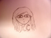
For this project, we had to make our own logos using Adobe Illustrator to be placed in our future projects. I chose to put my face and my initials in my project so that it will truly represent me when it's placed in other works that I create in the future. I also included some art supplies above it, since this logo will be used on my art projects in this class. I used the elements of art by using lines to create the form of my face and other objects in the logo. I used the principles of design by making my face symmetrically balanced, making the feature on my face proportionate, and making the whole design have harmony. My final product accurately represents my sketch, except that I didn't draw the art tools on my sketch, and I didn't show my eyes on the logo like I did on the sketch.
Tuesday, October 25, 2011
typoSCENE
The title of this assignment it typoSCENE, where we had to make a scene that includes one of our previous projects, typoOBJECT. We were expected to produce this by first creating a shape that we want using the pen tool, then creating outlines on the text that named what object we were creating with that shape. Afterwards, we used envelope distort on that shape we made, and all this was to be done using Adobe Illustrator. My final product showed my typoOBJECT design, which was a guitar, with a closet on the background, and a table beside it, to represent a room. I also put a picture frame and a candle on the table, as well as a light switch on the wall. I used the elements of art by including achromatic value on the closet, adding color on the objects in my scene, and by using the words to create the form of those objects. I used the principles of design by having harmony throughout the project, making the objects proportionate with each other, and by repeating the words in my project that creates rhythmand movement. My final design accurately represents most parts in my sketch, since I put the table, closet, and other objects in my design on the same place that I drew them on my sketch. The only difference is that I wasn't able to include other things in my project, that I planned in my sketch, such as books, shoes, and carpet.
Friday, October 14, 2011
Myself Collage
For this assignment, we were expected to produce a quality project of our choice using Adobe Photoshop or Adobe Illustrator, so that it can be submitted into art competitions. My final product, entitled About Myself, shows an image of myself, with several other things placed around it to represent the things that I'm interested in. I used the elements of art by using the pen tool in Adobe Photoshop to connect lines that make the form of my face. I included many colors all throughout my project, and had a white background take up the negative space and my face design taking up the positive space. I used the principles of design by adding gradation on the lines that makes my form or shape, having variety on the images that I placed in my project, making my facial features proportionate, and having repetition, movement, and rhythm. My final product also doesn't fully represent my sketch, since there were many other things I placed in my project that I didn't draw out on my sketch.
Friday, October 7, 2011
Zombify
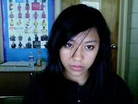
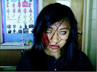
This assignment is called zombify, where we were expected to produce a zombie version of our picture using the tools in Adobe Photoshop. My final product showed an image of myself with several wounds and blood on my face, a knife on my head, and some blood splattered on the wall in the background. I used the elements of art by changing the opacity of the bloods in my image to create different shades of red, or value. My picture takes up the positive space, while the wall in the background took up the negative space. I used the principles of art by putting emphasis on the bloods in my project, which are the dominant elements. I made my image proportionate, like the mouth that I added to my face, and the knife on my head. There's also repetition with my use of blood in my project, which I did to make my face look more like a zombie. My final design doesn't accurately represent a sketch, since we weren't required to draw sketches for this project.
Monday, October 3, 2011
TypoOBJECT
This assignment is called TypoOBJECT, where we were expected to produce a typography design of a certain object using Adobe Illustrator. We had to use one font, and use the envelope distort option to put the words inside the path we created, which represented the object we were making. For my project, I chose to make a guitar. I made it using the names of the different parts of a guitar. I also included a guitar strap, an amplifier, and a cable, since I had extra time. I used the elements of art by creating different shapes of the parts of the guitar, having achromatic value, and creating form of the guitar using words. I used the principles of designs by creating harmony throughout my design, having variety on the way I used the words, making the different parts of the guitar proportionate, and creating having repetition on my design that shows movement and rhythm. My design accurately represents my sketch, since they both show where the parts of guitar would be placed in. The only difference is that my sketch didn't include the strap, amp, and cable, since I didn't plan on creating those extra objects as part of my whole project.
Thursday, September 22, 2011
Typeface Art
(Parrot)
The title of this assignment is typeface art, where we were expected to produce a typography image using the letters of an animal or object that we choose. We were to produce this project in an 8x11 inch document using Adobe Illustrator. I chose a parrot for my project, where I used the font Arista 2.0. I used all the letters in the word 'parrot', with the capital A's mostly being used as the feathers on the wings, and lowercase r's as smaller feathers on the body and the face. I also used the other letters throughout my design, and I chose their colors of red, orange, yellow, and blue to represent those of a real parrot. I used the elements of art by connecting lines that the letters create to form the outline of the parrot, and by using monochromatic colors of red, yellow, and blue to show shadings or shadows. I used the principals of design by having harmony on my project, having proportion on the different parts of the parrot, and using repetition of the letters, which creates rhythm. My final design accurately represents my sketch, since they show the same position of the parrot, and where the letters were supposed to be placed. The only difference was that my sketch didn't have the whole image of the parrot filled up with letters, and my final product looks neater and finished.
Tuesday, September 20, 2011
Typeface Project
(Warm Colors, Monochromatic, and Freestyle)
The title of this assignment is called typeface. We were expected to produce three typography projects using our first, middle, and last name using Photoshop or Illustrator. My final product consisted of my first name being designed with monochromatic colors of purple, my middle name being freestyle, and my last name being designed with warm colors. I used to elements of art by using monochromatic value of purple on my first name, adjusting the intensities of the hues in my three projects, and using the letters as positive with the background as negative space. I used the principles of design by somewhat including an asymmetrical balance on my warm project, adding contrast by changing the intensities of the colors I used, and by having repetition, movement, and rhythm. My final product doesn’t accurately represent my sketch, since I had to change the letters around more when I started my projects in Photoshop. I also changed some of the colors that I planned to use while sketching.
Subscribe to:
Posts (Atom)