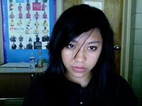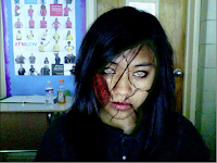


This assignment is called zombify, where we were expected to produce a zombie version of our picture using the tools in Adobe Photoshop. My final product showed an image of myself with several wounds and blood on my face, a knife on my head, and some blood splattered on the wall in the background. I used the elements of art by changing the opacity of the bloods in my image to create different shades of red, or value. My picture takes up the positive space, while the wall in the background took up the negative space. I used the principles of art by putting emphasis on the bloods in my project, which are the dominant elements. I made my image proportionate, like the mouth that I added to my face, and the knife on my head. There's also repetition with my use of blood in my project, which I did to make my face look more like a zombie. My final design doesn't accurately represent a sketch, since we weren't required to draw sketches for this project.
No comments:
Post a Comment