

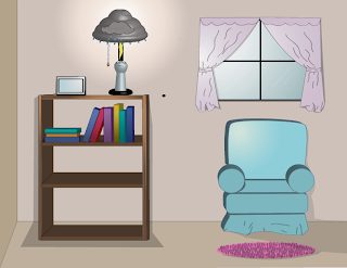

In this project, we had to make a space around the lamp that we created in our previous project using Adobe Illustrator. We were able to put 3D effects again to create the room that the lamp is in. For my project, I placed my lamp in a typical room, on top of a bookshelf. In that room, I also created a picture frame, a plant, chair, rug, and a window. I used the elements of art by using lines to create the shape of the objects in my room, having value and color, and by showing texture on the flower pot and rug. I used the principles of design by including gradation to show where the light is coming from, as well as by having harmony and variety. This accurately represents my sketch, except that in here, I added the picture frame and the window curtains.
Monday, December 12, 2011


Tuesday, December 6, 2011
myLamp


For this project,we had to create our own unique lamps using adobe illustrator. We had to apply 3D effects to make our lamps look real. My final product shows a lamp that's designed as a person standing under a cloud. The lamp shade has symbols of clouds and rain, and i also included a symbol of a lightning that's about to strike the person. I used the elements of art by including color, which shows the form of the lamp,value, and a smooth texture. I used the elements of design by making my lamp balanced and proportional. This accurately represents my sketch, except for the lamp shade, which didn't turn out the way I planned it to, and the facial expression in the person, which I changed while working on this assignment.
Wednesday, November 30, 2011
Emotion- Submission


For this Assignment, we were each given an emotion, with mine being submission. We had to create an icon for that emotion, making it simple and minimal. My final product shows a man kneeling to a king and holding a white flag. Since submission means to surrender or yield to the authority of another, I made the man hold a white flag to show surrender, and drew him kneeling to show that he's recognizing the authority of the king. The elements of art used in my project includes the lines that were used to make the shapes of the king, man, flag, and chair in my project. I used the principles of design by making the objects in my project proportionate. This accurately represents my sketch, since I first drew a white flag as one idea, and the man kneeling to a king as another idea. The difference was that I combined those two ideas in my sketch here on my final project.
Monday, November 21, 2011
stillPHOTO


For this assignment, we had to create a still life image of a particular object in a real picture that we took using the tools Adobe Illustrator. My final product shows a television that I photographed, with branches I created that were coming out of the t.v. I used the elements of art by using lines and adding color to create the form of the branches. I used the principles of design by adding gradation to the branches to make them look more realistic, having harmony and variety throughout the project, and having a repetition of branches. My final design accurately represents my sketch, since I placed the branches in my final design on the same spot that I drew them on my sketch. The only difference is that I planned to add one more branch that I didn't get to create on my final product.
Wednesday, November 9, 2011
Tessellations


In this project, we had to make our own tessellations using Adobe Illustrator. My final product basically has a theme of music, which includes a guitar, a radio, headphones, a musical staff, and musical notes. It also contains pink lines on the back, with an overall yellow background. I used the elements of art by including a hexagon shape to create the base of the whole project, using lines to separate each kite inside the hexagon as well as to create the images in those kites including the guitar, radio, etc. I also used the Live Pain Bucket Tool to add the colors in this project. I used the principles of design by having radial balance in my project, and having repetition on my designs. I used the rotate tool to make them repeat in a rotation, which shows movement and rhythm in my design. This accurately represents my sketch, since I placed the images that I created on my project on the same spot that drew them on my sketch.
Monday, November 7, 2011
Color Wheel

In this one-day project, we were expected to create a color wheel using several tools in Adobe Illustrator, including the Line Segment tool, Rotate tool, and Live Paint Bucket tool. I used the Ellipse tool to create the shape of two circles that are aligned, then the Line Segment tool to make the lines that separate the spaces between them. Those spaces were then filled with colors using the Live Paint Bucket tool. I used the Polygon tool to create the shape of the triangle in the middle of the circle. This project shows a radial balance, harmony, and proportion on the spaces in the circles that were colored. I also used repetition to make the lines inside the circles. I didn't make a sketch for this project since we weren't required to.
Tuesday, November 1, 2011
My Logo


For this project, we had to make our own logos using Adobe Illustrator to be placed in our future projects. I chose to put my face and my initials in my project so that it will truly represent me when it's placed in other works that I create in the future. I also included some art supplies above it, since this logo will be used on my art projects in this class. I used the elements of art by using lines to create the form of my face and other objects in the logo. I used the principles of design by making my face symmetrically balanced, making the feature on my face proportionate, and making the whole design have harmony. My final product accurately represents my sketch, except that I didn't draw the art tools on my sketch, and I didn't show my eyes on the logo like I did on the sketch.
Subscribe to:
Posts (Atom)