The title of this assignment it typoSCENE, where we had to make a scene that includes one of our previous projects, typoOBJECT. We were expected to produce this by first creating a shape that we want using the pen tool, then creating outlines on the text that named what object we were creating with that shape. Afterwards, we used envelope distort on that shape we made, and all this was to be done using Adobe Illustrator. My final product showed my typoOBJECT design, which was a guitar, with a closet on the background, and a table beside it, to represent a room. I also put a picture frame and a candle on the table, as well as a light switch on the wall. I used the elements of art by including achromatic value on the closet, adding color on the objects in my scene, and by using the words to create the form of those objects. I used the principles of design by having harmony throughout the project, making the objects proportionate with each other, and by repeating the words in my project that creates rhythmand movement. My final design accurately represents most parts in my sketch, since I put the table, closet, and other objects in my design on the same place that I drew them on my sketch. The only difference is that I wasn't able to include other things in my project, that I planned in my sketch, such as books, shoes, and carpet.
Tuesday, October 25, 2011
Friday, October 14, 2011
Myself Collage
For this assignment, we were expected to produce a quality project of our choice using Adobe Photoshop or Adobe Illustrator, so that it can be submitted into art competitions. My final product, entitled About Myself, shows an image of myself, with several other things placed around it to represent the things that I'm interested in. I used the elements of art by using the pen tool in Adobe Photoshop to connect lines that make the form of my face. I included many colors all throughout my project, and had a white background take up the negative space and my face design taking up the positive space. I used the principles of design by adding gradation on the lines that makes my form or shape, having variety on the images that I placed in my project, making my facial features proportionate, and having repetition, movement, and rhythm. My final product also doesn't fully represent my sketch, since there were many other things I placed in my project that I didn't draw out on my sketch.
Friday, October 7, 2011
Zombify
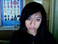
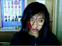
This assignment is called zombify, where we were expected to produce a zombie version of our picture using the tools in Adobe Photoshop. My final product showed an image of myself with several wounds and blood on my face, a knife on my head, and some blood splattered on the wall in the background. I used the elements of art by changing the opacity of the bloods in my image to create different shades of red, or value. My picture takes up the positive space, while the wall in the background took up the negative space. I used the principles of art by putting emphasis on the bloods in my project, which are the dominant elements. I made my image proportionate, like the mouth that I added to my face, and the knife on my head. There's also repetition with my use of blood in my project, which I did to make my face look more like a zombie. My final design doesn't accurately represent a sketch, since we weren't required to draw sketches for this project.
Monday, October 3, 2011
TypoOBJECT
This assignment is called TypoOBJECT, where we were expected to produce a typography design of a certain object using Adobe Illustrator. We had to use one font, and use the envelope distort option to put the words inside the path we created, which represented the object we were making. For my project, I chose to make a guitar. I made it using the names of the different parts of a guitar. I also included a guitar strap, an amplifier, and a cable, since I had extra time. I used the elements of art by creating different shapes of the parts of the guitar, having achromatic value, and creating form of the guitar using words. I used the principles of designs by creating harmony throughout my design, having variety on the way I used the words, making the different parts of the guitar proportionate, and creating having repetition on my design that shows movement and rhythm. My design accurately represents my sketch, since they both show where the parts of guitar would be placed in. The only difference is that my sketch didn't include the strap, amp, and cable, since I didn't plan on creating those extra objects as part of my whole project.
Subscribe to:
Posts (Atom)