Monday, January 30, 2012

Doodle4google


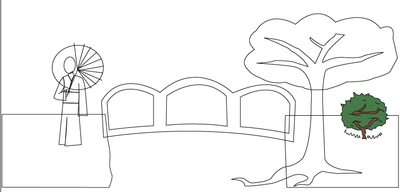
This project was made for the "doodle 4 google" competition. We were expected to make a doodle that shows what place we would visit if we could travel time. My final products shows a scene in medieval japan, with a geisha used to make the "G", a bridge to make the two "o"s and second "g", a cherry blossom tree for the "l", and a bush to show the "e". I used the elements of art by using lines to create the shapes in the project, including colors, and I attempted to show texture on the water and the tree. I used the principles of design by placing gradation on the tree, the cherry blossom petals, the water, and the sky to make them look realistic, having harmony throughout the design, and by having repetition on the petals to show rhythm and movement. This also accurately represents my sketch, since I placed the objects in my project on the same place that I drew them.

Thursday, January 19, 2012

mySELF


In this project, we were expected to make an illustration of our face that also shows things relating to our personalities and interests using adobe illustrator. My final product includes a soccer ball and a galaxy for the eyes, a pencil and paintbrush for the eyebrows, ice cream for the nose, a leaf for the mouth, and a tree for the neck. I also had a film strip, camera, flowers and a guitar in the project. I used lines to make the shapes of my face and the objects in it, included color, and also tried to show texture on the tree and the shirt. For the principles of design, I made my face symmetrically balanced, and also used gradation with low opacity in my attempt to create shadows on my face. This accurately represents my sketch, since I placed the objects in my final product on the same spot that I drew them on my sketch.

Thursday, January 12, 2012

Product Sheet


For this assignment, we had to create a product sheet for our previous project, myProduct. We were expected to put information about the product that we made using adobe illustrator. I used the elements of design by using lines to create the border of the sheet and adding color to the background. I used the principles of design by putting enough contrast between the words and the background so that the words can be read, and by having harmony in my project. This does not exactly represent my sketch, since I drew the glasses in different spots in my sketch compared to where I placed them on my final product.

Thursday, January 5, 2012

myPRODUCT


In this assignment, we had to create our own product using adobe illustrator. My final product shows everyday glasses that also have night vision, which you can turn on by pressing a button. I used the elements of design by having color, which shows the form of the glasses, as well as a smooth texture applied on the glasses. I used the principles of design by having gradation on some parts of the glasses, which appears to be reflections of the light, to make them look more realistic. I also made the parts of the glasses proportionate to each other, which creates harmony throughout the design. My final product accurately represents my sketch, since I showed them in 3 different angles that I drew them on in my sketch.