Thursday, May 3, 2012

landscape

In this assignment, we were supposed to create a landscape animation using adobe flash. It had to be at least 7 seconds long, with at least two tweens. My final product shows a scene with two mountains in the background, several trees, grass, a river, and the sun rising. I used the elements of art by using lines to create the shapes of the objects in my scene, and by including color in them. I used the principles of art by having harmony throughout my project, making things proportionate, and by using repetition on the grass and trees to show movement.

Thursday, April 12, 2012

Website


For this project, we had to create our own static website using either adobe photoshop or illustrator, as well as dream weaver. My final product was a personal website that shows my many of my art works, as well as photos and other information about me. I used the elements of art by including colors, and having the background as negative space while the text area was the positive space. I used the principles of design by having repetition throughout the website, and movement, since my background was a gif.

Tuesday, March 20, 2012

Web Design


In this assignment, we had to design the home page for our web site that we're creating. We were supposed to do this using adobe photoshop or illustrator. My final product is titled "Kristine's Creations," with the links placed on the right side, and the text area in the middle, colored in light purple. My background is colored black with glowing pink orbs, and i also included images of a guitar, paint, soccer ball, and myself on the heading. I did all this in both photoshop and illustrator. I used the elements of art by using lines to create the icons that represents the links, by including color, and by having the purple text area and links as positive space and the black background as the negative space. I uses the principles of design by having enough contrast with the page title and the background, by making a purple and pink gradient on the text area, and by using repetition on the circles and orbs in the design. This doesn't fully represent my sketch, since i placed the page title differently on my sketch than on my actual design.

Monday, March 12, 2012

Kony Promo Pack


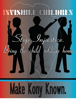
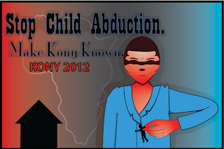
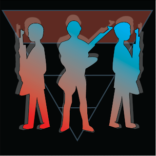
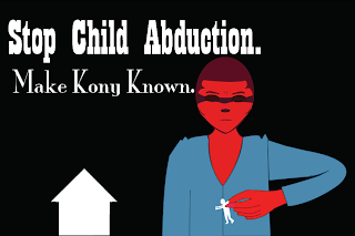
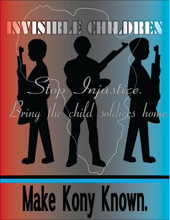
In this assignment, we were expected to produce a promo pack for the Kony2012 campaign. We had to create a poster, flyer, and sticker design using adobe illustrator or photoshop. My poster shows a silhouette of child solders, with a quote saying "bring the child soldiers home," and a red, gray, and blue gradient as the background. My flyer shows an exaggerated Kony that was drawn big, with him taking a child from his home, to represent his abduction of children. My sticker shows the silhouette again, with a black background, and the upside-down pyramid as part of the background. I used the elements of art by using lines to create the shapes of the silhouettes and the big Kony, as well as by including color in my designs. I used the principles of design by using gradation, as well as by having harmony in my projects. This accurately represents my sketch, except that my sketches were drawn with less details than the actual product.

Tuesday, March 6, 2012

CPsheet


For this Character Profile sheet, we were supposed to provide all the information and background story of the character that we made. We were expected to make this using the tools in Adobe Illustrator. My final products includes the three perspectives of my character, with black boxes that have the information written in light blue text. I also included images of cupcakes, books, and a sword with low opacity on those boxes to have more details and show my character's interests. I used the elements of art by using lines to create the extra images in the black boxes, and by having color throughout the project. I used the principles of design by adding a gradation of blue and purple in the background, having harmony in my project, and by repeating the cupcakes, books, as well as dots in the background to show rhythm and movement. I also did not create a sketch for this project.

Monday, February 27, 2012

myCHARACTER


For this project, we had to design our own character using Adobe Illustrator. My final design shows a noble school girl with red eyes and white hair, who uses a sword as her weapon. I used the elements of art by using lines to create the shapes of her features, and by including color. I used the principles of design by adding a gradient on the sword to make it more realistic, by making the body proportionate, and by trying to make everything harmonized. The first perspective of my design accurately represents my sketch, but the other two, I didn't get to sketch out.

Tuesday, February 14, 2012

ohSCAPE


For this assignment, we had to recreate a space in the school that we sketched out for two days in our sketch book. We had to create this using adobe illustrator. My final product shows the 2nd floor elevator, with a window on the wall next to it. I used the elements of art by using lines to create the form of the objects in my project, including the bricks on the walls and the lines on the floor. I included color on my project, and tried to apply texture on the wall by adding a grain effect. I used the principles of design by using gradation with low opacity to create the image of shadows, by making the elevator and window proportionate with the bricks on the wall, and by having repetition on the patterns on the floor. This accurately represents my sketch, since they both look similar to each other, except that this one in more detailed.

Monday, January 30, 2012

Doodle4google


This project was made for the "doodle 4 google" competition. We were expected to make a doodle that shows what place we would visit if we could travel time. My final products shows a scene in medieval japan, with a geisha used to make the "G", a bridge to make the two "o"s and second "g", a cherry blossom tree for the "l", and a bush to show the "e". I used the elements of art by using lines to create the shapes in the project, including colors, and I attempted to show texture on the water and the tree. I used the principles of design by placing gradation on the tree, the cherry blossom petals, the water, and the sky to make them look realistic, having harmony throughout the design, and by having repetition on the petals to show rhythm and movement. This also accurately represents my sketch, since I placed the objects in my project on the same place that I drew them.

Thursday, January 19, 2012

mySELF


In this project, we were expected to make an illustration of our face that also shows things relating to our personalities and interests using adobe illustrator. My final product includes a soccer ball and a galaxy for the eyes, a pencil and paintbrush for the eyebrows, ice cream for the nose, a leaf for the mouth, and a tree for the neck. I also had a film strip, camera, flowers and a guitar in the project. I used lines to make the shapes of my face and the objects in it, included color, and also tried to show texture on the tree and the shirt. For the principles of design, I made my face symmetrically balanced, and also used gradation with low opacity in my attempt to create shadows on my face. This accurately represents my sketch, since I placed the objects in my final product on the same spot that I drew them on my sketch.

Thursday, January 12, 2012

Product Sheet


For this assignment, we had to create a product sheet for our previous project, myProduct. We were expected to put information about the product that we made using adobe illustrator. I used the elements of design by using lines to create the border of the sheet and adding color to the background. I used the principles of design by putting enough contrast between the words and the background so that the words can be read, and by having harmony in my project. This does not exactly represent my sketch, since I drew the glasses in different spots in my sketch compared to where I placed them on my final product.